Don’t Look Event Identity
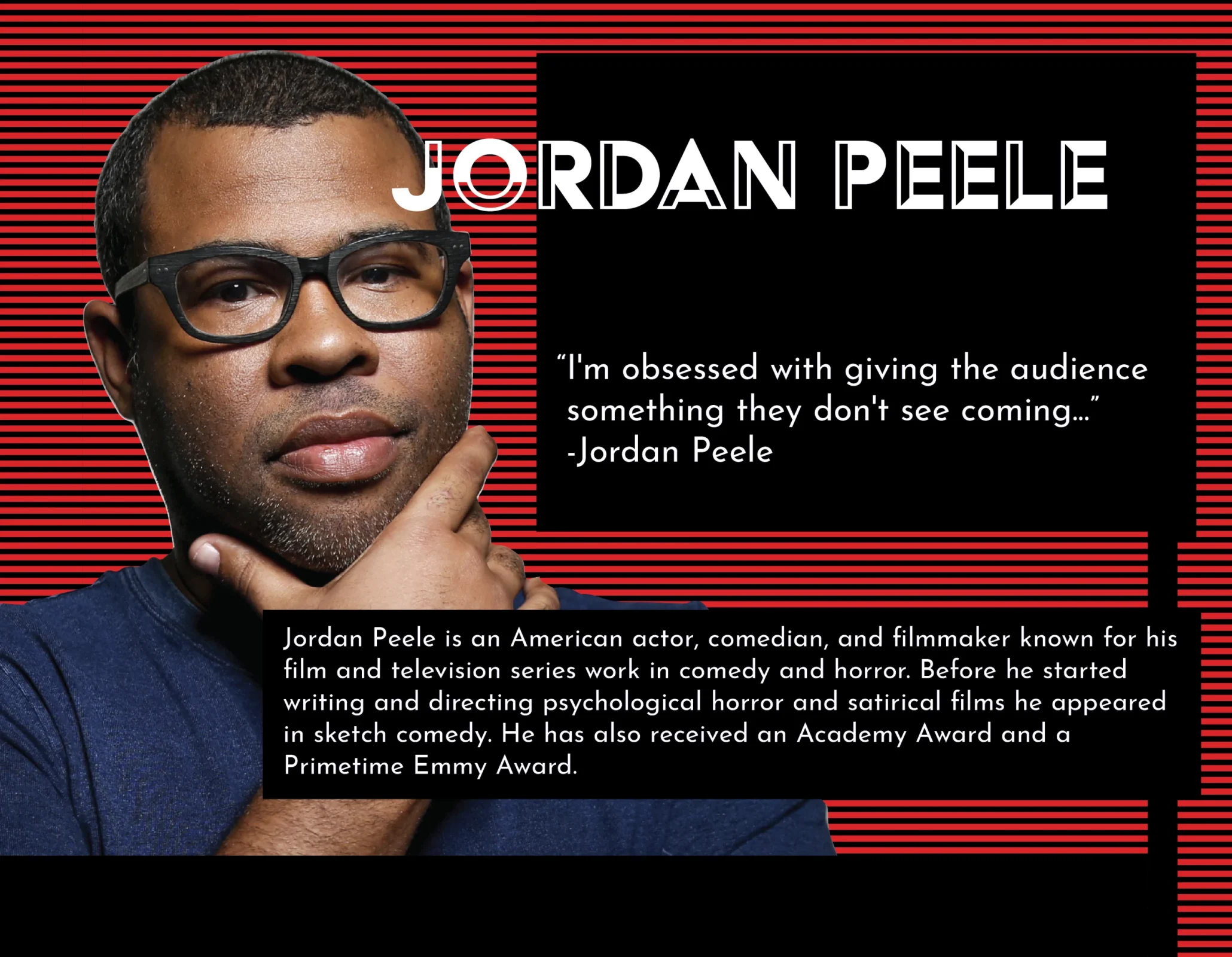
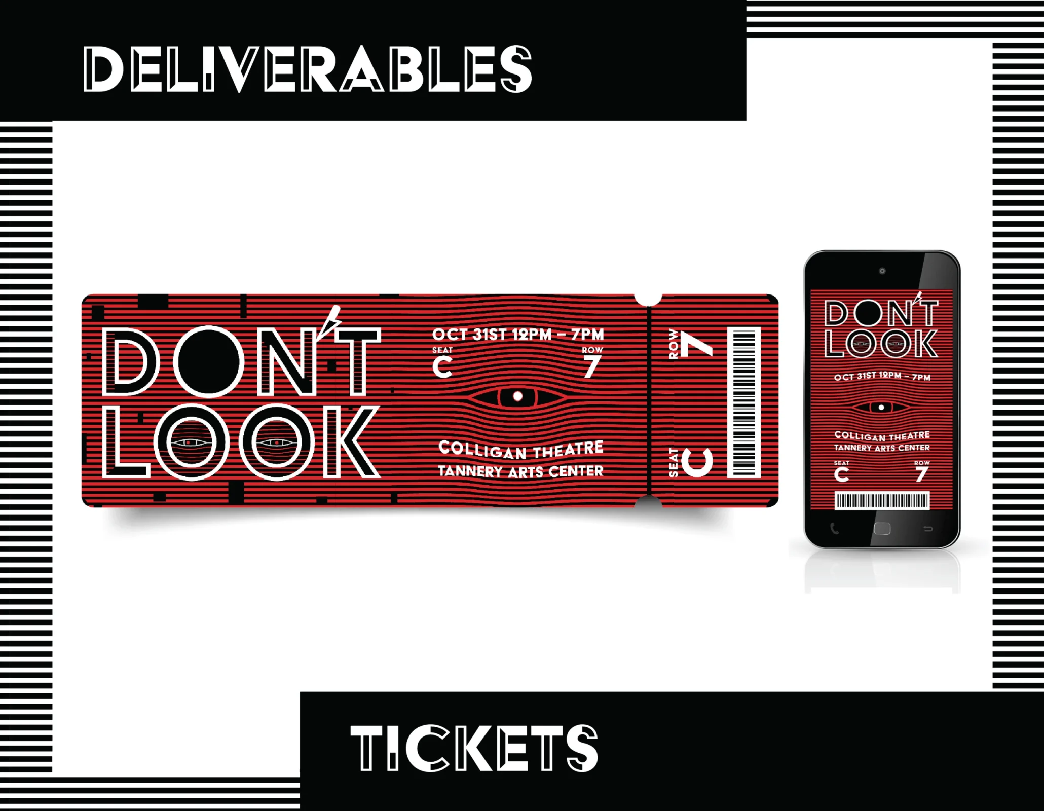
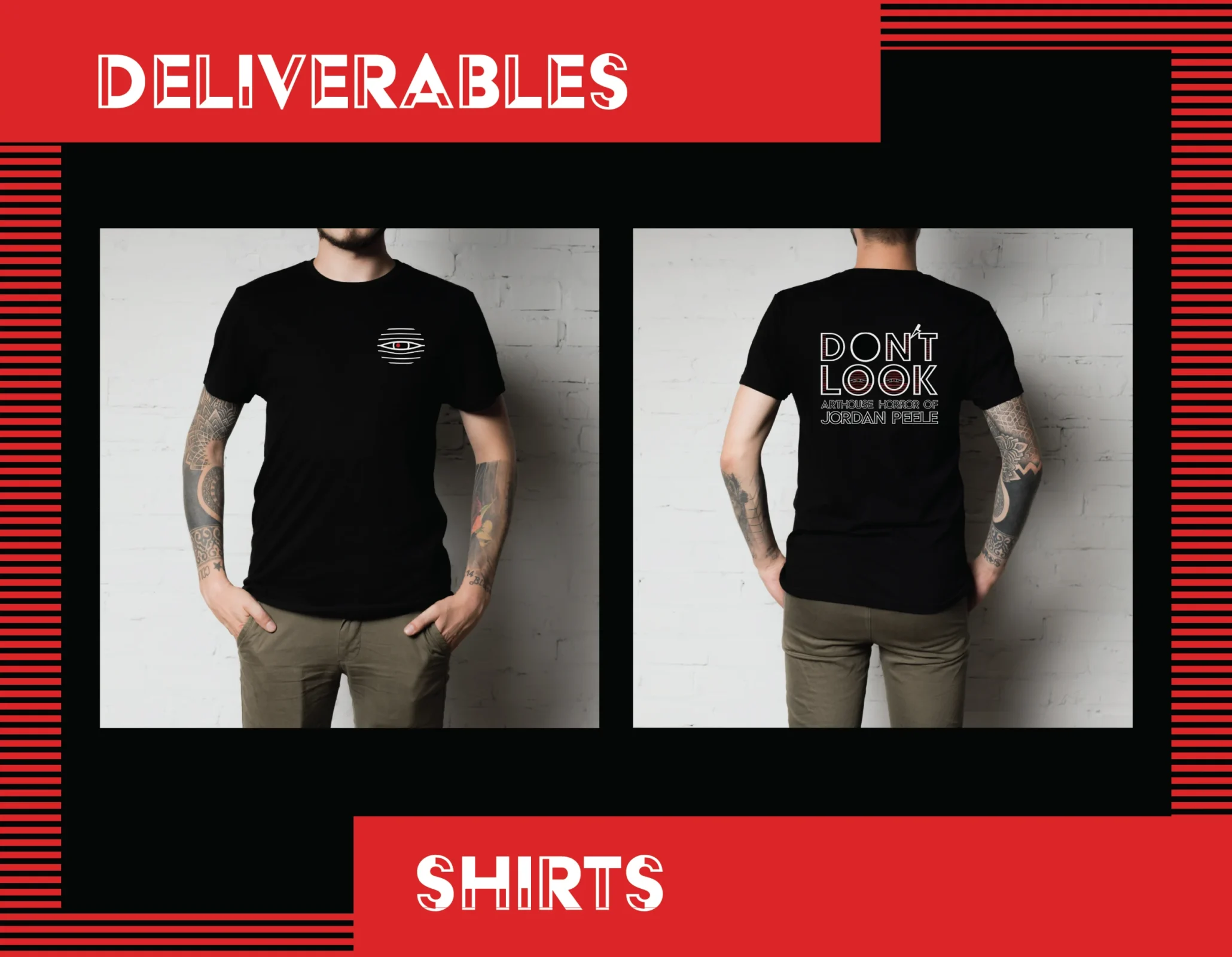
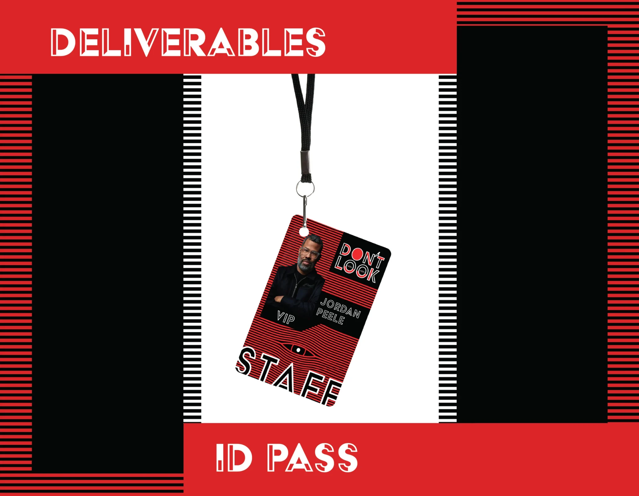
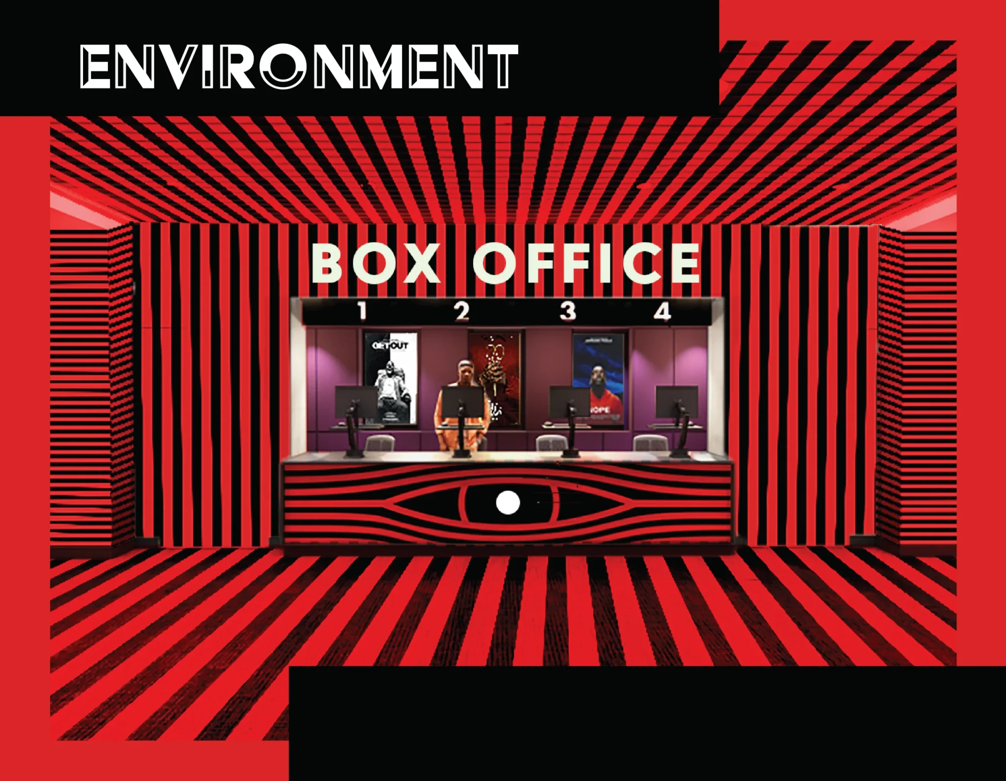
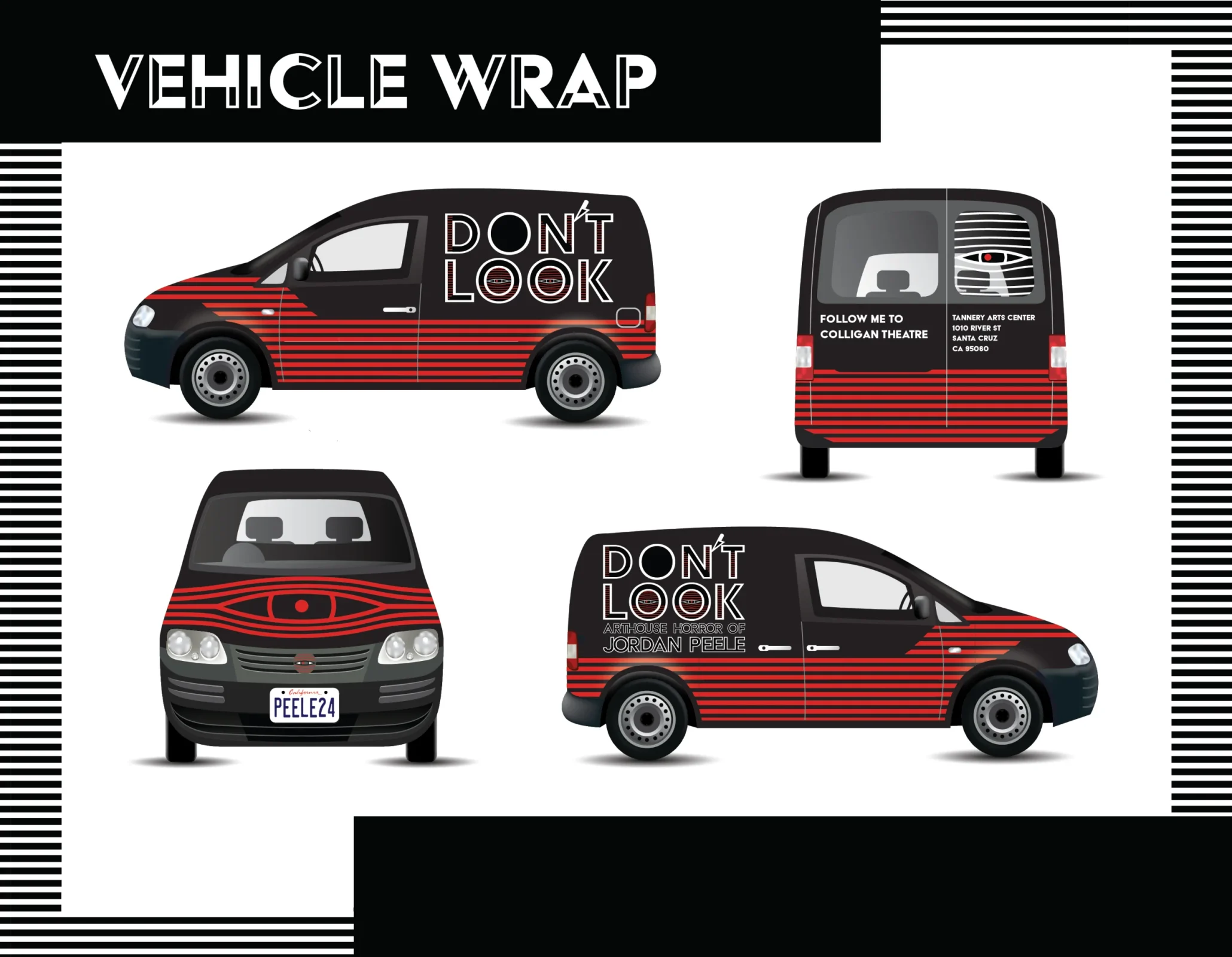
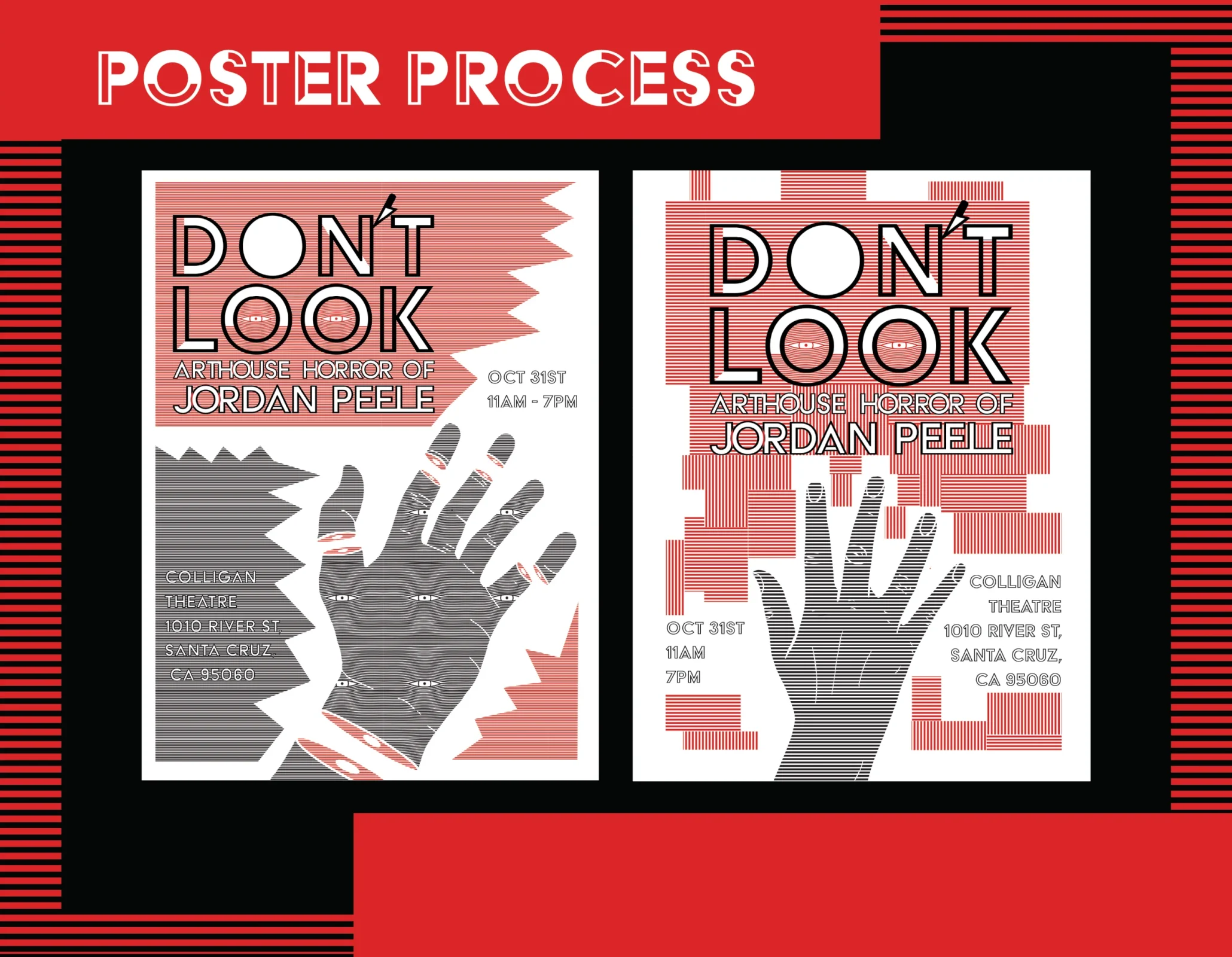
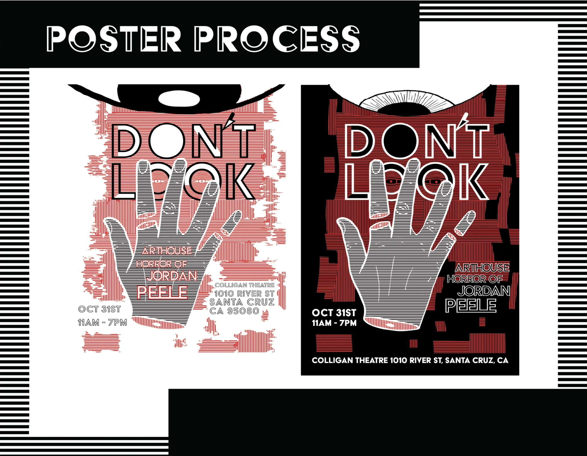
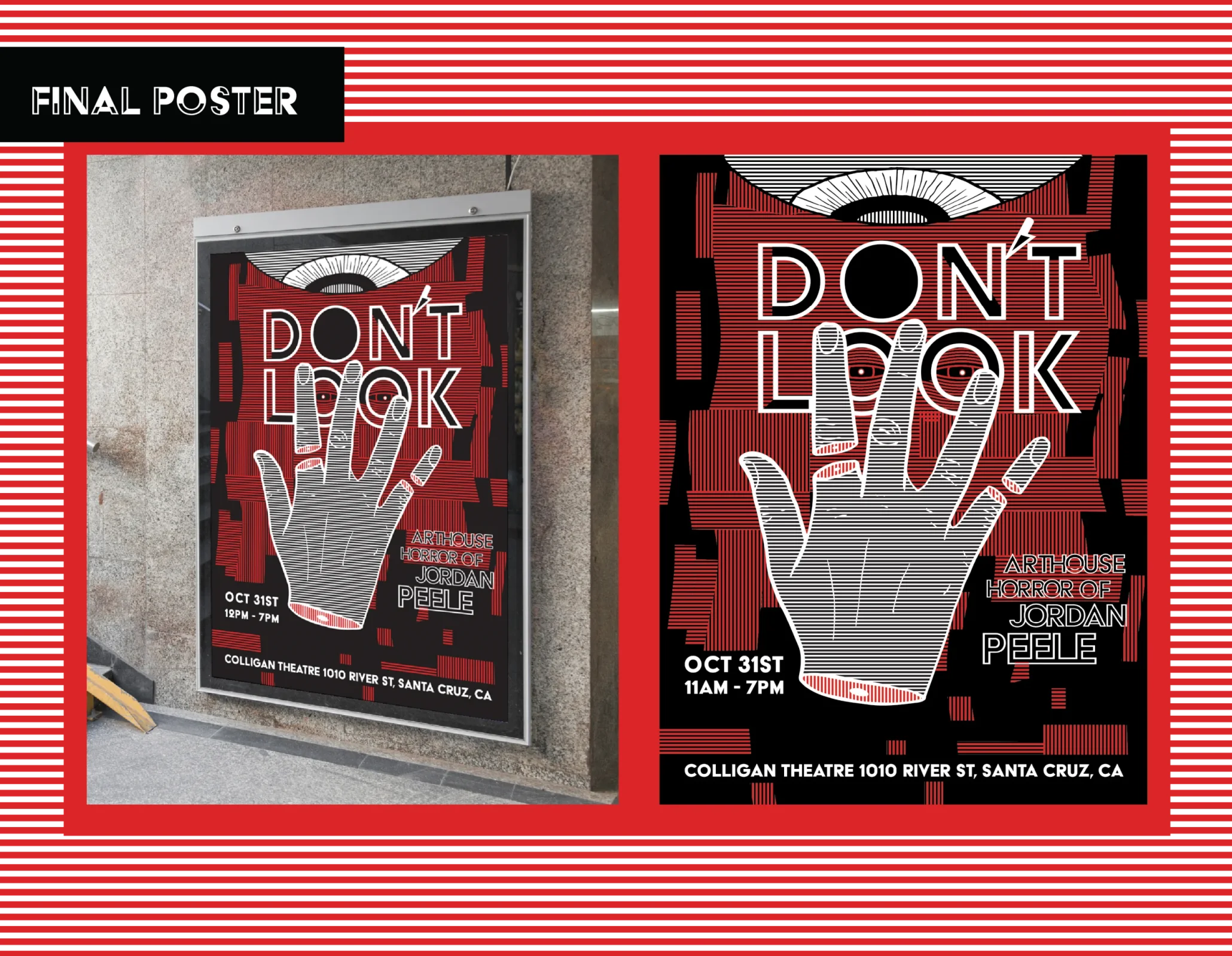
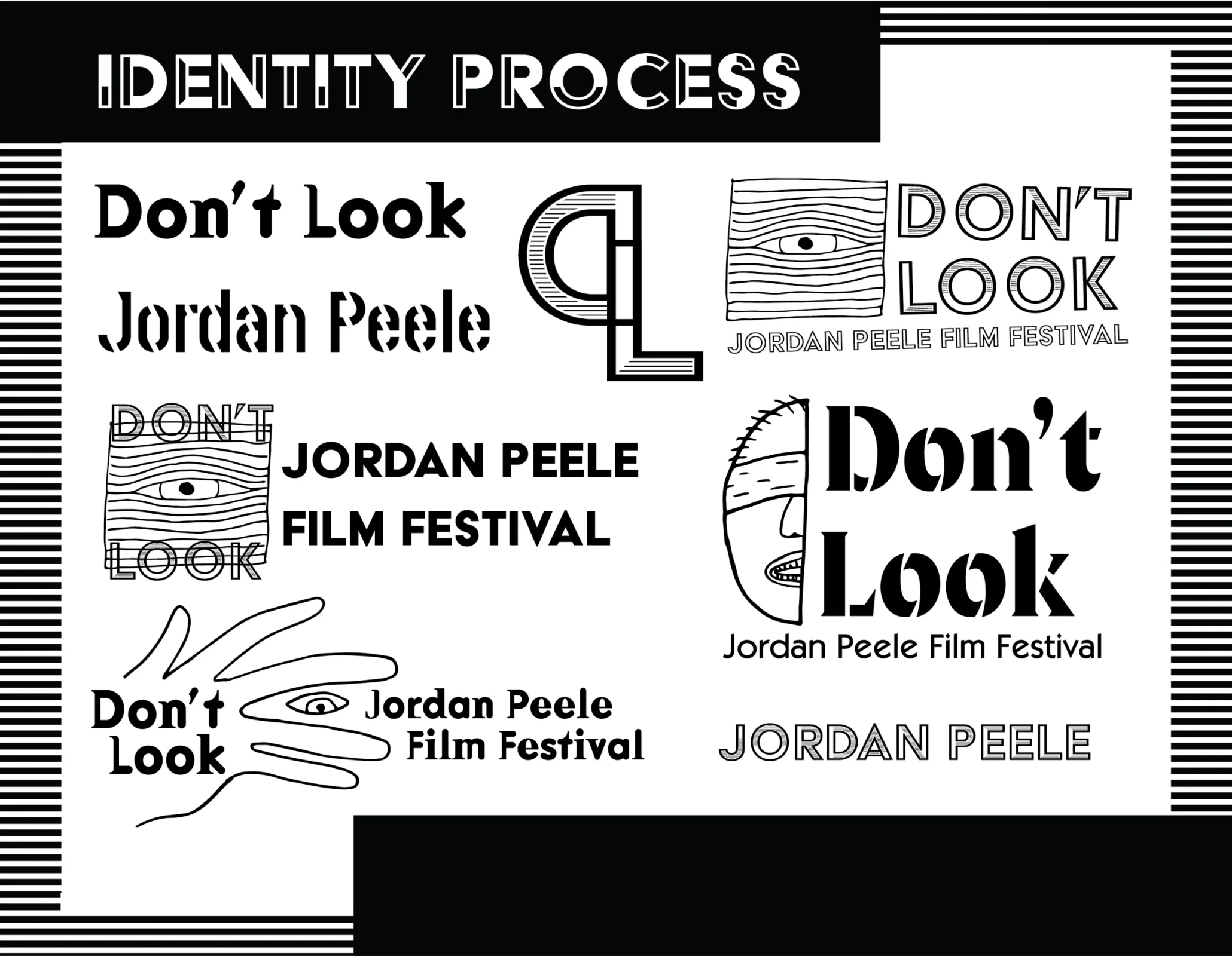
This is an identity I made for a film festival for the director Jordan Peele. We decided on a location to hold the festival, researched our target audience and the demographics of the area, then got to work creating an identity that would appeal to our audience and reflect the style and themes of Jordan Peele’s films. The identity was applied to a variety of applications including shirts, tickets, staff ID badges, environment, and a vehicle wrap.
I wanted to create a distinctive identity that captured the elements of Jordan Peele’s films. Jordan Peele’s recent films “Get Out”, “Nope”, and “Us”, all have short titles but they all have a lot of meaning in reference to the films. Peele’s films are horror films that tend to revolve around topics of racism and segregation, ugly truths about our culture that many people don’t want to accept or look at. I decided on “Don’t Look” because it’s short and references the horror aspect as well as the dark topics Peele focuses on.
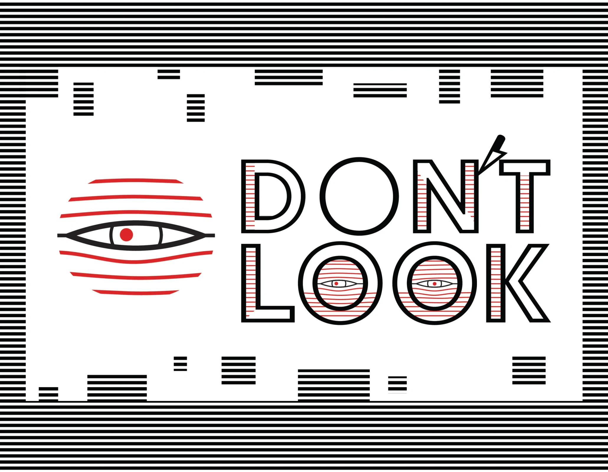
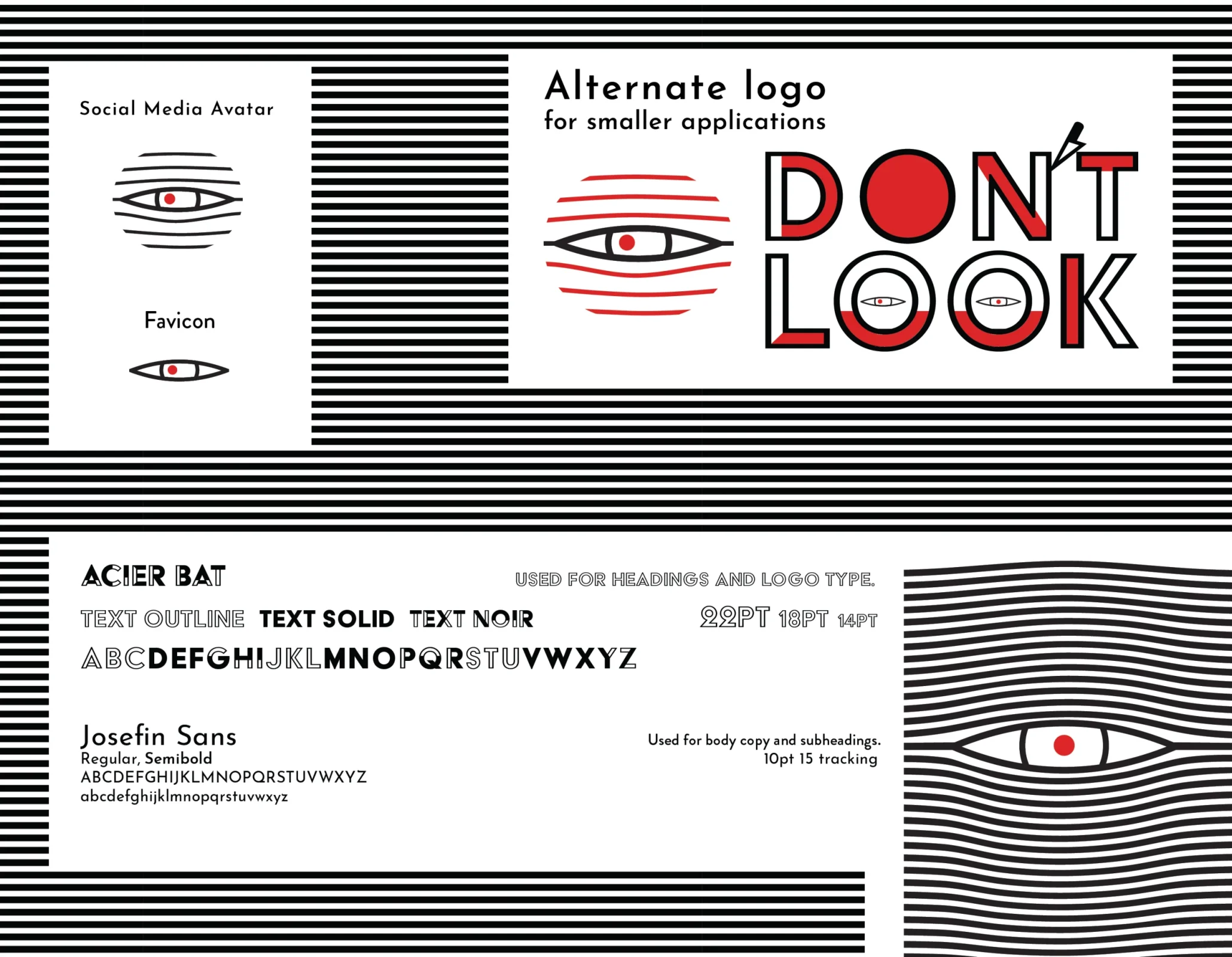
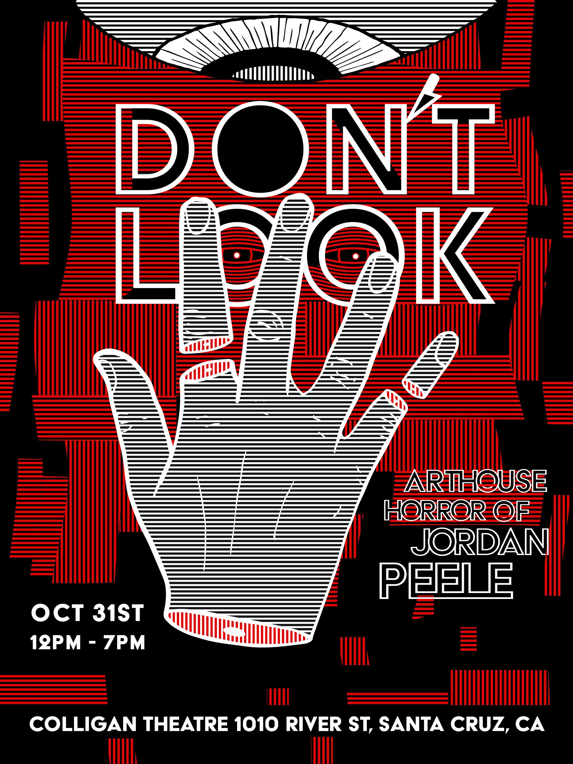
For the logo design, I decided on using a stripe pattern in the logo that almost looks like an eye peering through blinds. The two eyes in “Look” are looking slightly different directions to be more unsettling. The apostrophe got turned into a knife (another horror reference) and I decided to let it touch the “N” and “T” to add tension to the logo. The black, white, and red color scheme is meant to be a bit jarring to fit the personality of the identity.
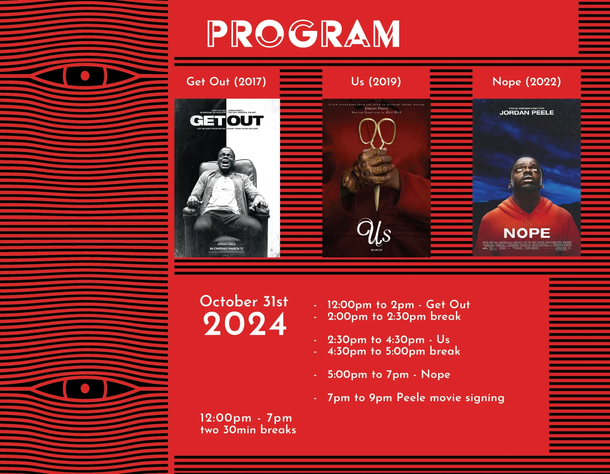
The stripes and eyes in the logo were elements that were easily translated to a variety of mockups. They were applied to a poster, shirts, tickets, event ID badges, a lobby mock up environment design, and a vehicle wrap.
